
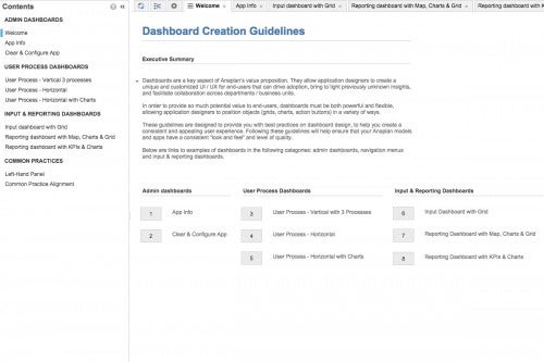
Dashboards are a key aspect of Anaplan’s value proposition. They allow application designers to create a unique and customized UI/UX for end-users that can drive adoption, bring to light previously unknown insights, and facilitate collaboration across departments/business units.
In order to provide so much potential value to end-users, dashboards must be both powerful and flexible, allowing application designers to position objects (grids, charts, action buttons) in a variety of ways. These guidelines are designed to provide you with best practices on dashboard design in order to help you create a consistent and appealing user experience. Following these guidelines will help ensure that your Anaplan models and apps have a consistent “look and feel” and level of quality.
Features
Included are links to examples of dashboards in the following categories:
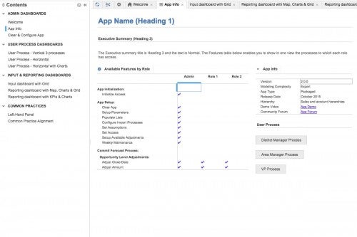
- Admin dashboards
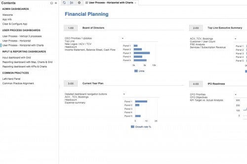
- Navigation menus
- Input dashboards
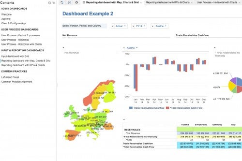
- Reporting dashboards


Information
Size
7.2 MB
Language
English
Stats
Roles
N/A
Formulas
N/A
Reports
N/A
Complexity
Beginner
termsTitle


